


.jpg)
.jpg)
Integrate colour psychology into your interior decoration
Creating a design interior in harmony with your emotional palette
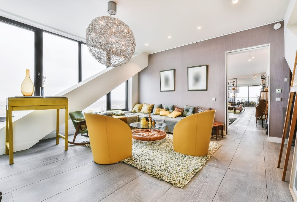
Creating a design interior in harmony with your emotional palette
Colour is far more than what our eyes perceive. It shapes our emotions, our reactions, and even our actions. Imagine your favourite clothing boutique: how do its colours influence your feelings? In the same way, the layout of our living space can greatly affect our well-being and mood. Whether colour associations and colour psychology are entirely new to you or you have been playing with this concept for years, colour psychology remains an important tool that must be used wisely in every home. But how do we recognise the colours that do us good?
Excellent question! And that is the subject of our article...
1. Colour as a tool to create an atmosphere
Colour psychology goes far beyond our visual preferences. It influences our emotional palette: relaxing us, energising us, or even prompting us to take action. Every shade we choose for our rooms can transform the atmosphere of our living space. In other words, colour psychology is a powerful tool that has a profound impact on our lives!
2. Colours and their emotional associations
The emotional palette we choose for our interiors is no accident. It is the echo of our souls, the reflection of our states of mind. The shades we select weave a colourful atmosphere, telling stories without a word. Before exploring the language of colours and beginning your renovation projects, remember that colour is perceived differently according to your experiences, your culture, and your upbringing. Grasp the fundamental associations at play in the decoration of any room in your home through our short guide:
- Red: From the stimulation of vibrant, energetic red to the softness of pink, this colour is a symbol of courage, strength, and power.
Illustration:
In Chinese culture, red evokes strength and symbolises luck and good fortune. However, mixed with black, it can be reminiscent of death. So be mindful of how you use it!
At home, red energises a room. It is often chosen to decorate the living room or office as it stimulates and sparks discussion. Adding a red armchair or cushion can become the centrepiece and boost the atmosphere.

- Orange: A vibrant and warm shade, joyful and grounded, it stimulates and energises.
Illustration:
Orange evokes the colour of Vermont autumn leaves, Indian saffron, or the hues of Laurel Canyon.
Thanks to its stimulating power, orange is ideal for a gym, a reception hall, or a kitchen with bronze furniture handles. Using this orange colour in these spaces can motivate and energise the atmosphere. Fascinating!

- Yellow: Yellow, often associated with joy and sunshine in the West, is the colour of optimism. Like a sunflower at the end of summer: it radiates a natural warmth. But a yellow that is too dark can suggest mistrust.
Illustration:
In China, yellow symbolises authority, reign, or wealth. Places such as the Taj Mahal use a special golden yellow.
In decoration, a bright yellow brings cheerfulness. On the other hand, a yellow with softer shades creates a peaceful atmosphere, especially when combined with other pastel colours. Dare to use the yellow shade for your bathroom with white or copper-coloured handles.

- Green: Representing life, harmony, and renewal, green offers a varied palette of emotions, from tranquillity to energy.
Illustration:
Depending on the culture, green symbolises luck (as in Ireland), prosperity (in the United States), or peace (in ancient Greece).
To decorate with green, think about the atmosphere you want to create. For your bedroom, consider pastel green for rest and mint green to freshen up your kitchen.

- Blue: With its many shades, blue can be both calm and serene, intelligent and pensive, sad and serious, or playful and vivid.
Illustration:
In nature, blue is found in precious stones such as lapis lazuli and sapphire, known since ancient Egypt.
In terms of decoration, navy blue, serious and reflective, is ideal for making an office look elegant. Dark wood shelves with golden accessories such as trendy furniture handles.

- Purple: This colour ranges from deep, dark shades to light and soothing hues.
Illustration:
Historically, purple is often associated with royalty, luxury, and indulgence.
In the world of decoration, its lighter shades such as lavender and lilac, known for their soothing effect, are perfect for spaces such as bathrooms or children's bedrooms.

- White: A symbol of innocence, purity, and perfection in Western culture. White is versatile and can be both soothing and stimulating.
Illustration:
Accentuate white walls with textiles in soft shades such as eggshell or ivory, to create a peaceful and relaxing atmosphere.
As for interior decoration, choosing the right shade of white can be tricky, so it may be wise to consult an expert to find the perfect nuance. White offers a versatile backdrop that enhances other colours and textures. Imagine a living room with design door handles, immaculate white walls, punctuated with colourful artwork and natural wood furniture.

- Black: Elegant and formal, black is bold and carries a hint of mystery.
Illustration:
While in China it may evoke bad luck, in ancient Egypt it was a symbol of life, inspired by the rich black soil of the Nile.
In decoration, black makes a bold statement. For a dining room with black walls, contrast them with gold furniture, creating a luxurious and theatrical setting, perfect for sophisticated cocktail evenings.

- Brown: Earthy and robust, brown is associated with reliability and strength.
Illustration:
The colour brown evokes nature and refinement.
Rather than painting the walls brown, imagine a living room with a warm wooden floor, a robust leather sofa, and a carved wooden coffee table, which gives a sense of groundedness and authenticity.

- Grey: Sophisticated and timeless, grey is the colour of balance, a neutral anchor for any space.
Illustration:
Imagine a kitchen with grey cabinets, contrasted by a white marble worktop and touches of green plants, giving the space a modern look while remaining welcoming.

Colour brings life and emotion to your space. If you feel lost, don't hesitate to ask an interior designer for help to illuminate your home!
3 - Colour psychology for your home
Now that you are armed with a general understanding of colour associations, it is time to apply what you have learned to your own home. Exciting, isn't it?
Discovering the colours that suit you is a three-step journey. A path we will travel together, but one you can also explore at your own pace.
STEP 1: EXPLORE:
- Connect with nature: let yourself be charmed by the shades that catch your eye and speak to you.
- Think about the colours of your favourite spaces: how do you feel in these places that are close to your heart? Which shades attract you?
- Think about the travels that have shaped your palette: which landscapes have captured your heart?
- Document your inspirations: capture these colour moments, whether in photos or notes.
STEP 2: CREATE:
- Create a visual collage: whether on a mood board or a photo album, gather the images that resonate with your emotions.
- Look for images that evoke the desired atmosphere: select those that sing the song of your future space.
STEP 3: REFINE:
- Revisit your choices: distil your inspirations, focus on the shades that will build your personal oasis.
- Develop a cohesive palette for each room: match the colours so they work in harmony throughout your home.
- Consult an expert if needed: sometimes, a guiding hand can help you illuminate your vision.
The year 2023 is highlighting bold colours. Vivid shades such as deep blue, rich green, striking red, and pink are on trend. These choices are partly due to the pandemic, which pushed people to want more stimulating interiors.
Moreover, the eco-style trend favours shades close to nature with the introduction of new hues such as:
Turquoise: evokes the sea.
Mustard: adds an organic nuance.
Coral: evokes the natural colours of autumn.
Lavender: trending colour of 2023.
Cobalt: a deep reminder of the oceans.
Apricot: a soft and summery shade.
Ultimately, mastering colour psychology offers incredible potential to enrich and personalise your interior. It is a creative journey that invites you to express your individuality and create a space that resonates with your personality. Whether you are looking for a haven of peace or an invigorating space to stimulate your creativity, colours are your most faithful allies.
To add the finishing touch to your space, don't forget the importance of details. At Milla Handles, we offer a diverse collection of design door handles that align perfectly with your chosen colour palette and add functional elegance to your décor. Visit our site to discover how our door handles can become the jewels of your living space. Click here to find the missing piece of your interior design puzzle.

Comments
No comments yet!
Leave your comment